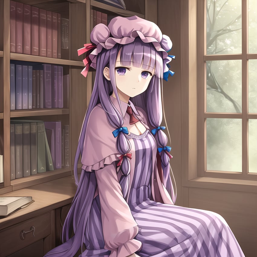
Resized to 55% of original (view original)

| Prompt | 8k, 4k, (highres:1.1), best quality, (masterpiece:1.3), (((1girl, solo, patchouli knowledge))), sleepy, beautiful detailed eyes, ((purple dress, crescent, mob cap)), (wood, bookshelf, library, (((warm light)))), sitting |
|---|---|
| Negative prompt | 3d, surreal, abstract, lowres, bad anatomy, (((((bad hands, fusion finger, lose finger, multiple finger, multiple digit, fusion hand, interlocked fingers, long fingers, long fingernails, webbed hands, own hands together)))), text, error, ugly, duplicate, morbid, broken limb, incorrect limb, lose leg, fused leg, multiple leg, bad feet, fewer digits, cropped, worst quality, low quality, normal quality, simple background, jpeg artifacts, signature, watermark, username, blurry, text font ui, malformed hands, long neck, missing limb, (mutated hand and finger: 1.5), (long body: 1.3), (mutation poorly drawn: 1.2), disfigured, malformed mutated, multiple breasts, futa, yaoi, furry, anthro, nude, (loli:1.3), bare breasts, nsfw, (heterochromia:1.2), (multicolored eyes:1.12), (mismatched pupils:1.12), one eye closed, asymmetrical ears, asymmetrical legs, asymmetrical arms, asymmetrical eyes, x-ray, motion blur, afterimage, tanlines, multiple views, dynamic angle, dynamic pose, out of frame, 2girls, (((outside))) |
| Sampler | DPM++ 2M Karras |
| Seed | 3242600195 |
| Steps | 40 |
| Cfg Scale | 7.5 |
| Model Hash | a501ddd7 |
- ‹ prev Search: sleepy ai:sleepy,0% next ›

Patchouli is kind of a vibe, tbh
Gah, this one was so hard to perfect. I've been iterating on different prompts and parameters since 5 AM (it's now noon). So many fucked up hands. It seems that there was always a trade-off - either I could have a really nice and detailed style but with wacky hands (lower CFG scale), or a really "generic" style with more consistent hands (higher CFG scale). I think it's because there's not as much Patchouli training data as Marisa or Reimu. Shame, she's such a "vibe" character.
In addition, different samplers all seem to have their own unique overall style. I like the style of DPM++ 2M Karras, I feel it captures the "wooden" feel of a library really nicely, and seems to add more detail to books, making them seem more actually like books than book-shaped rectangles.
---
Image was generated at 768x768, and upscaled 2x with the Remacri model.
Also, some additional generation parameters than AIBooru didn't have fields for:
Clip skip: 2
ENSD: 31338